
Health Packaging Redesign
A new take on Band-Aid packaging, one that incorporates inclusive design elements to meet the needs of users with varying abilities.
All parts were printed, cut, and assembled by hand
Illustrator / Photoshop / Lightroom
4.375 x 3.125 x 1.625 inches, print

The Challenge
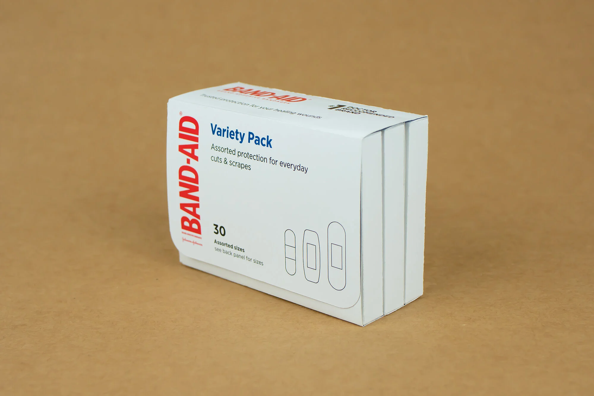
Developing an empathetic approach to design and challenging design norms is essential to address varying user needs and abilities. I was challenged to take an existing health product’s packaging and adjust the design to be more accessible.
The original package was required to stay the same. I could only change the hierarchy of the design, while maintaining any brand content including images, colors, illustrations, etc.


The Method
For a package that is designed for someone who gets hurt (which is everyone!) it would make sense that its contents would be easy to reach. Not to mention the information on the outside should be easy to read. Even for my four eyes, I have a difficult time deciphering the small type of the original package. So I focused on researching what type size and amount of contrast would best improve the legibility for the user.
To make the package more organized and accessible to users with limited hand mobility, I divided each type of bandage into three smaller sections. This way, the user also doesn’t have to dig through the entire box for the bandage they’re looking for. Similar to sticky notes that have glue on alternating sides, the bandage can be pulled out with one hand.


